
Color Palette Extractor
Turn the most prominent colors in an image into a compact palette. Copy any HEX value into a design file or stylesheet.
How to use the color palette extractor
How to pull a color scheme out of a single image.
Choose an image
Choose an image that your browser can open, such as a JPG, PNG, or WebP photo, logo, illustration, or screenshot.

Review the automatic analysis
After you choose the file, its color distribution is analyzed and the dominant colors are organized into a palette. Each color is shown with its HEX value.
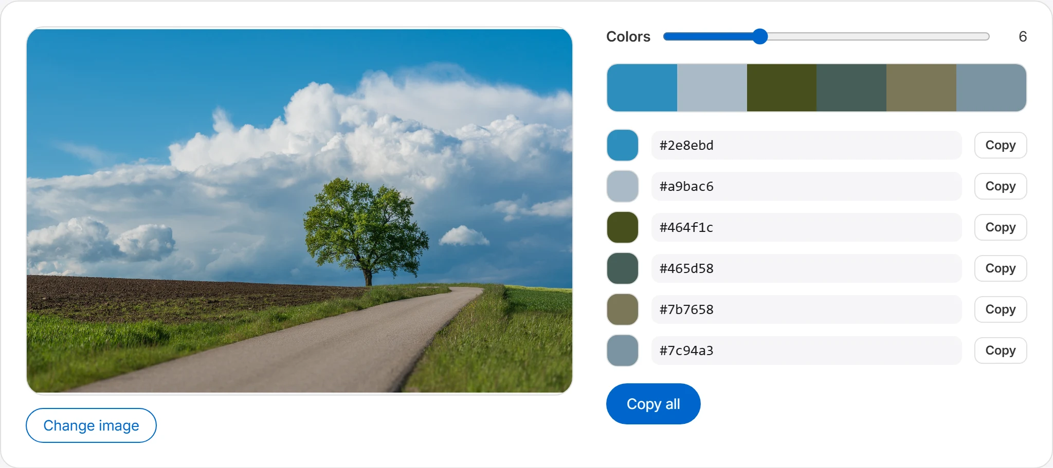
Adjust the number of colors
Use the colors option to control how many colors the palette shows. Set it low for just the key colors, or higher to see the image's fuller range of tones.
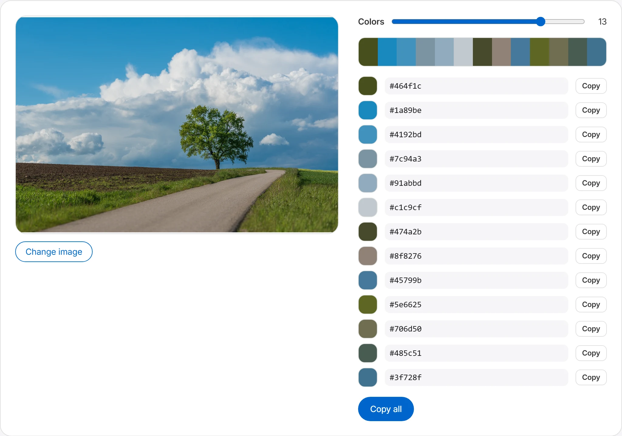
Copy and use them
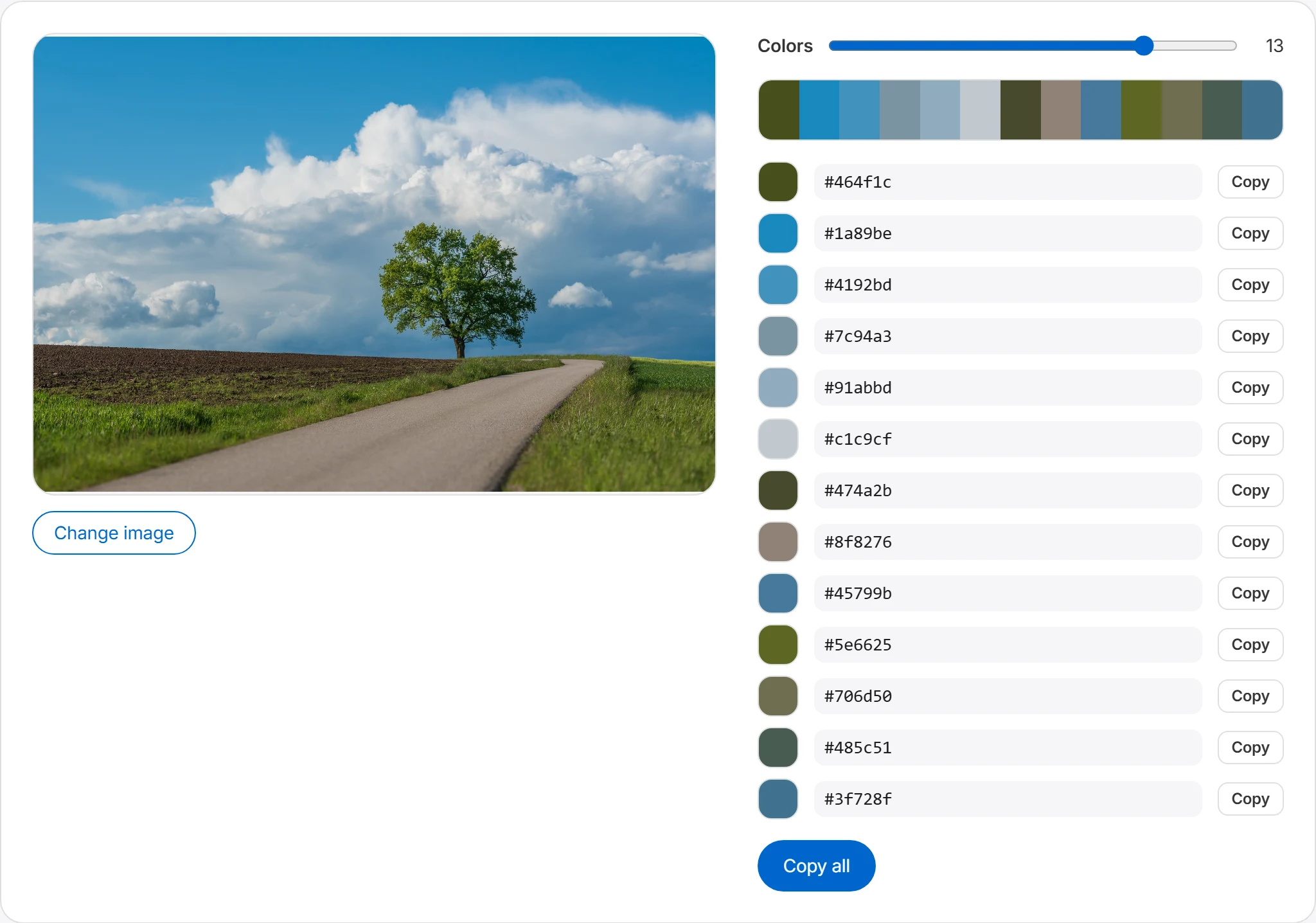
Copy any color's HEX value individually, or grab the whole palette at once with “Copy all.” Paste the values straight into CSS, design tools, or documents.
Summarize frequent colors in a palette
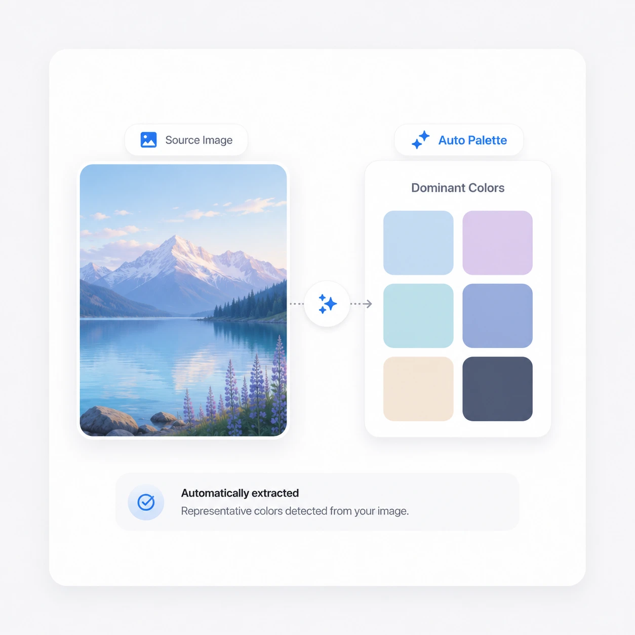
The tool analyzes the image's color distribution and groups dominant colors into a palette. Use the result as a starting point for photos, logos, illustrations, and screenshots.
Copy HEX color values and reuse them
Copy the palette's HEX values into a design file or codebase. Check contrast and assign each color a role before using the palette in a website, presentation, poster, or brand guide.
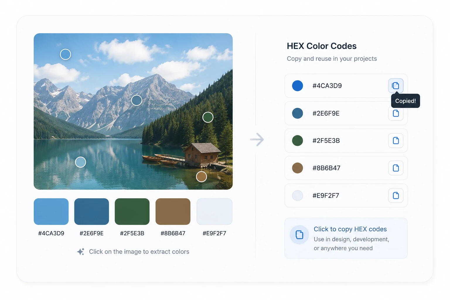
Ways to use an extracted palette
An extracted palette provides a starting set of colors from a reference image.
Designing a website color scheme
Extract a palette from a reference image, then test suitable colors for backgrounds, text, and accents. Check text contrast separately before using the palette in an interface.
Building a brand mood board
Extract palettes from several photos that match your brand's feel and collect them. You end up with a curated set of brand color candidates for logos, packaging, and social content.
Unifying presentation colors
Apply colors extracted from your cover image to titles, shapes, and charts, and the whole slide deck gains a sense of unity.
Frequently asked questions
How many colors are extracted?
The number of colors extracted from an image can vary by the settings. Extracting around 5 to 10 representative colors is usually enough to capture an image's mood. Too few colors makes it hard to represent an image's range of tones, while too many can make the palette feel cluttered. For design work, a palette of about five colors is often the most usable, so you can split it into primary, secondary, and accent colors.
In what format can I view the extracted colors?
The extracted colors are mainly available as HEX codes. HEX is the most common color format in web design and CSS, so it's easy to copy and paste straight into your code. For example, if an extracted color is #0066cc, you can use it in CSS like this.
.button {
  background-color: #0066cc;
}
Can the extracted colors feel different from the original image?
They can. Palette extraction pulls representative colors from the whole image, so they may look different from the color of a specific spot you focused on. For example, if a background color takes up a large part of the image, it may be extracted as a representative color first. If you want to check the exact color at a specific point, it's best to use the color picker as well.
Can I use images with a transparent background?
Yes, you can use PNG images with a transparent background. That said, for images with large transparent areas, how the transparency is handled can affect the result more than the visible colors. Images with a transparent background, like logos or icons, are analyzed with a focus on the colored areas, so you can get a more accurate palette.
Can I extract a palette from a screenshot?
Yes, you can extract a palette from screenshots of websites or app screens too. Capturing a webpage, app UI, or banner design you like and checking its key colors helps when you want to create a design with a similar mood. That said, if a screenshot mixes many elements, background, text, and image colors may all be analyzed together, so cropping to just the area you need is a good approach.