CSS Gradient Generator
Design linear and radial gradients visually and copy ready-to-use CSS.
Click the bar to add a stop, drag a handle to move it, or click a handle to remove it.
background: linear-gradient(90deg, #0066cc 0%, #2997ff 100%);Build a gradient with the mood you want
Adjust the colors, angle, and stop positions while previewing the gradient live. See the color flow that fits backgrounds, cards, buttons, and banners, and shape the style you want fast.
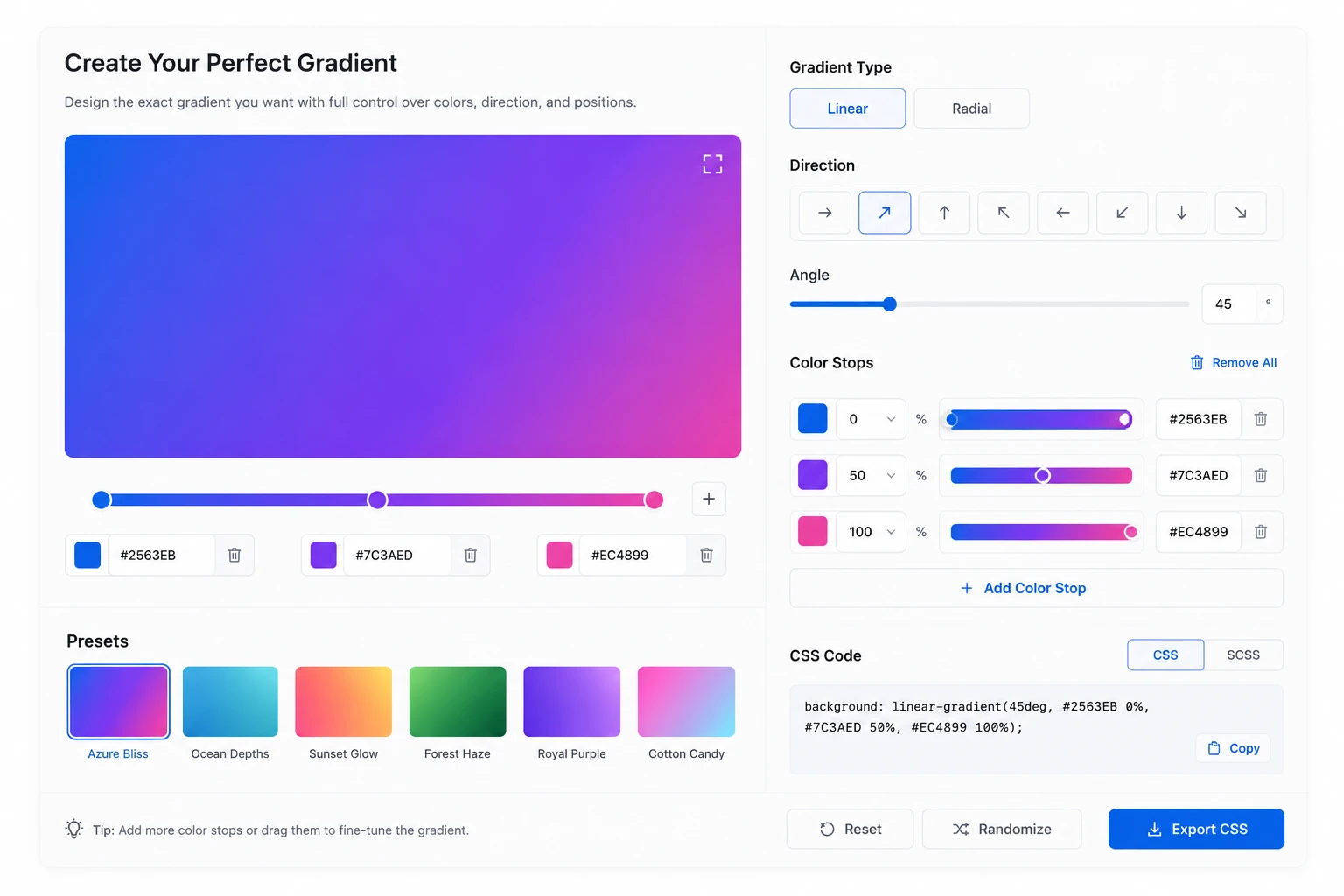
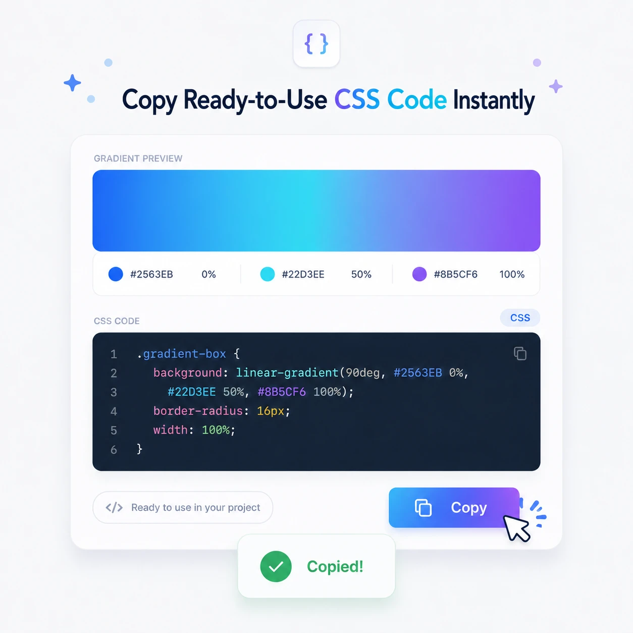
Copy the finished CSS code right away
Your finished gradient is turned into a CSS background declaration automatically. Press the copy button to save the code with your current settings to the clipboard and paste it straight into your project.
Recommended gradients
We've prepared frequently used color combinations as presets. Pick a gradient you like to edit it right in the editor, or copy its CSS code to use in your project. Adjust the colors and angle to fit backgrounds, buttons, cards, banners, and posters, and finish a gradient that's all your own.
background: linear-gradient(90deg, #0066cc 0%, #2997ff 100%);background: linear-gradient(60deg, #ff5e62 0%, #ff9966 100%);background: linear-gradient(120deg, #2193b0 0%, #6dd5ed 100%);background: linear-gradient(135deg, #6a11cb 0%, #2575fc 100%);background: linear-gradient(90deg, #11998e 0%, #38ef7d 100%);background: linear-gradient(45deg, #ee9ca7 0%, #ffdde1 100%);background: linear-gradient(110deg, #00c6ff 0%, #7d5fff 50%, #ff5edf 100%);background: radial-gradient(ellipse, #ffd86f 0%, #fc6262 100%);Frequently asked questions
Which gradient types are supported?
Linear and radial gradients are supported. A linear gradient blends colors smoothly in one direction. Adjust the angle to flow left to right, top to bottom, diagonally, or any way you like. A radial gradient spreads color outward from a center point. It's great for glowing backgrounds, highlight areas, and soft accent effects. Examples) Linear gradient: buttons, banners, card backgrounds Radial gradient: hero backgrounds, accent effects, lighting feel
Can I copy the CSS code?
Yes, the gradient you create can be copied straight away as a CSS background declaration. For example, creating a linear gradient generates code like this.
background: linear-gradient(90deg, #0066cc 0%, #2997ff 100%);You can use the copied code in CSS files, React/Vue component styles, HTML inline styles, Tailwind custom styles, and more.
Is there a limit on the number of color stops?
A color stop marks where a color starts or changes within a gradient. Two colors are usually enough for a basic gradient, and adding more stops lets you build richer, more complex color flows. For example, a simple background that goes from blue to purple needs only two stops, while designs with several colors in sequence — like a rainbow or a layered background — work well with three or more. That said, too many stops can make the color flow look busy, so two to four is a good range for typical UI design.
Can I use it on mobile?
Yes, it works in mobile browsers too. You can adjust colors and angle to build a gradient and copy the CSS code on a smartphone or tablet as well. That said, when you need to fine-tune stop positions, working on a desktop can be more comfortable.
Can I edit the recommended gradients?
Yes. You can copy a recommended gradient and use it as is, or open it in the editor to change the colors or angle. If picking colors from scratch feels hard, start from a recommended preset and then adjust it little by little to match your brand colors or the mood of your project.
Do gradients display well across browsers?
Most modern browsers support CSS linear-gradient() and radial-gradient(). Major browsers like Chrome, Edge, Safari, and Firefox generally handle them without issues. That said, older browsers or unusual environments may render some details differently, so it's a good idea to check in the major browsers before shipping to production.